Brewing Better Experiences: A Conceptual Design for an E-Commerce Website

Project overview
Design Challenge and Responsibilities Overview
Duration
4 weeks
Disciplines
UI Design
UX Design
Branding
Responsibilities
Research
Branding
Visual Design
Wireframing
Prototyping
tools
Figma
DALL-E
Overview
Coffee_Shop is a conceptual e-commerce platform that brings ethically sourced coffee, curated brew tools, and stylish drinkware to coffee lovers. Designed over 4 weeks during an accelerated course, this project challenged me to create a brand from scratch and design a compelling shopping experience for passionate and curious coffee drinkers alike.
the problem and the solution
The Problem
Coffee lovers often face a scattered experience when trying to buy beans, learn about brewing, and find trusted tools, leading to frustration, analysis paralysis, or impersonal purchases.
The Solution
An intuitive, calming online store that centers quality, transparency, and simplicity. Coffee_Shop is a one-stop experience for buying, learning, and getting inspired about coffee. It brings together ethically sourced coffee, carefully curated tools, and educational resources (with future plans for blog and brew guides).
Process
Research
Secondary Research
In the absence of direct user interviews, I reviewed customer reviews and forums to uncover frustrations with current online coffee stores.
Common Pain Points:
Too many options without guidance.
Lack of clarity on grind types, roasts, and brewing compatibility.
Overwhelming information without beginner-friendly help.
The hunt for scattered information gets frustrating and time consuming.
Competitive Analysis
To understand the current landscape, I studied popular coffee e-commerce platforms like Blue Bottle and Stumptown. My goal was to identify standard UI patterns, product filtering logic, visual trends, and information hierarchy and areas of friction for users.
Result: Identified key trends like minimal UI, filterable categories, and lifestyle-forward photography.
Learning: While the layouts were consistent, many sites lacked warmth and educational content, a gap I aimed to address.
Process
Information Architecture
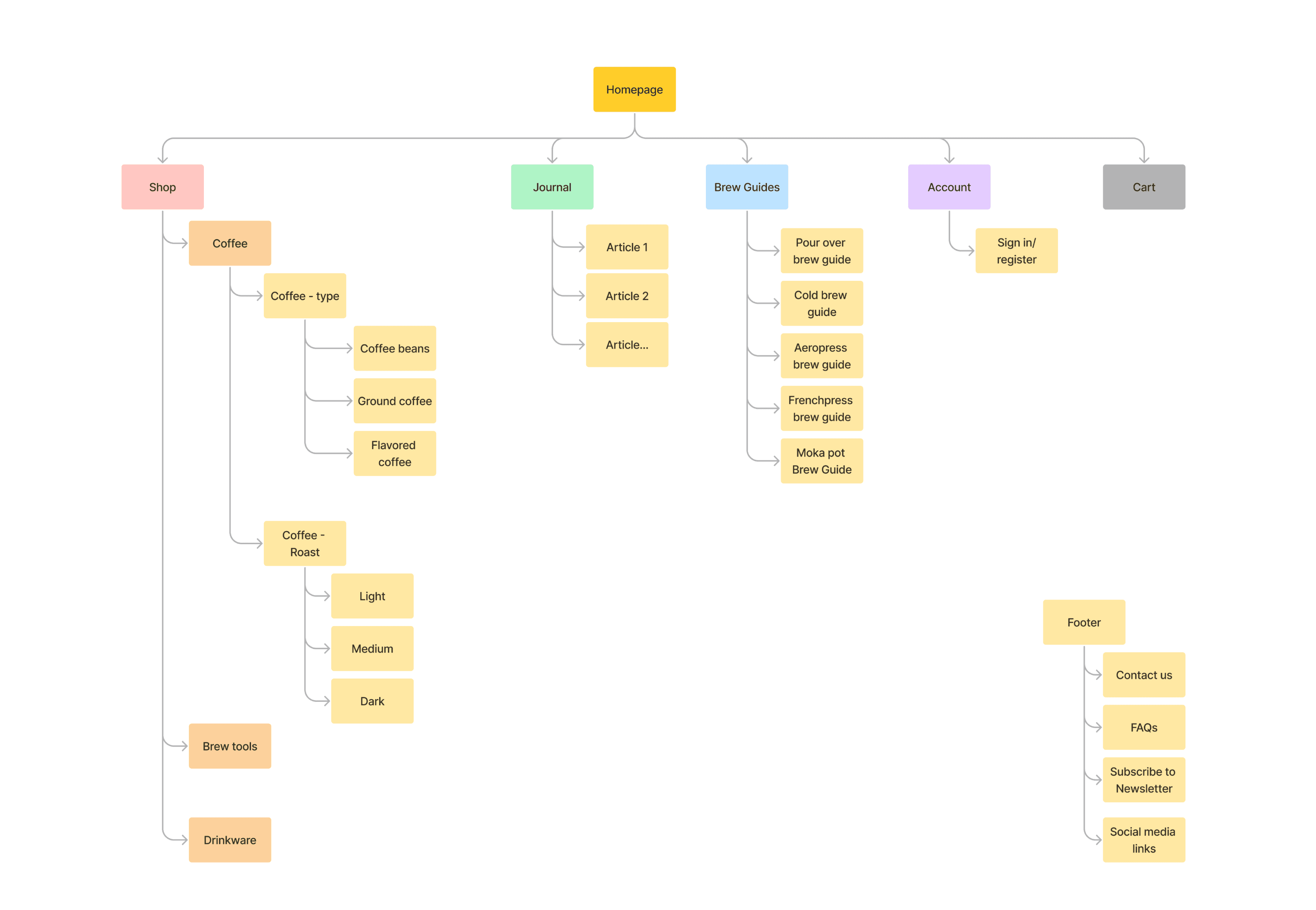
Sitemap
To understand the full scope of the Coffee_Shop experience, I first created a sitemap to visualize the site architecture. This included core pages like Shop, Brew Guides, and Journal, along with user account and cart flows. While I did not build out every section — such as the Brew Guides or Journal pages, this planning step clarified which features were essential for the MVP and which could be expanded in the future.
Userflow
Next, I created a user flow to simulate a typical shopping experience, from discovering coffee to adding it to the cart. My initial flow included the full checkout process, but given time constraints, I focused on the journey up to “Add to Cart” for this prototype. This decision helped me build a stronger core experience without compromising quality.

Process
visual design process
Style tile and Branding
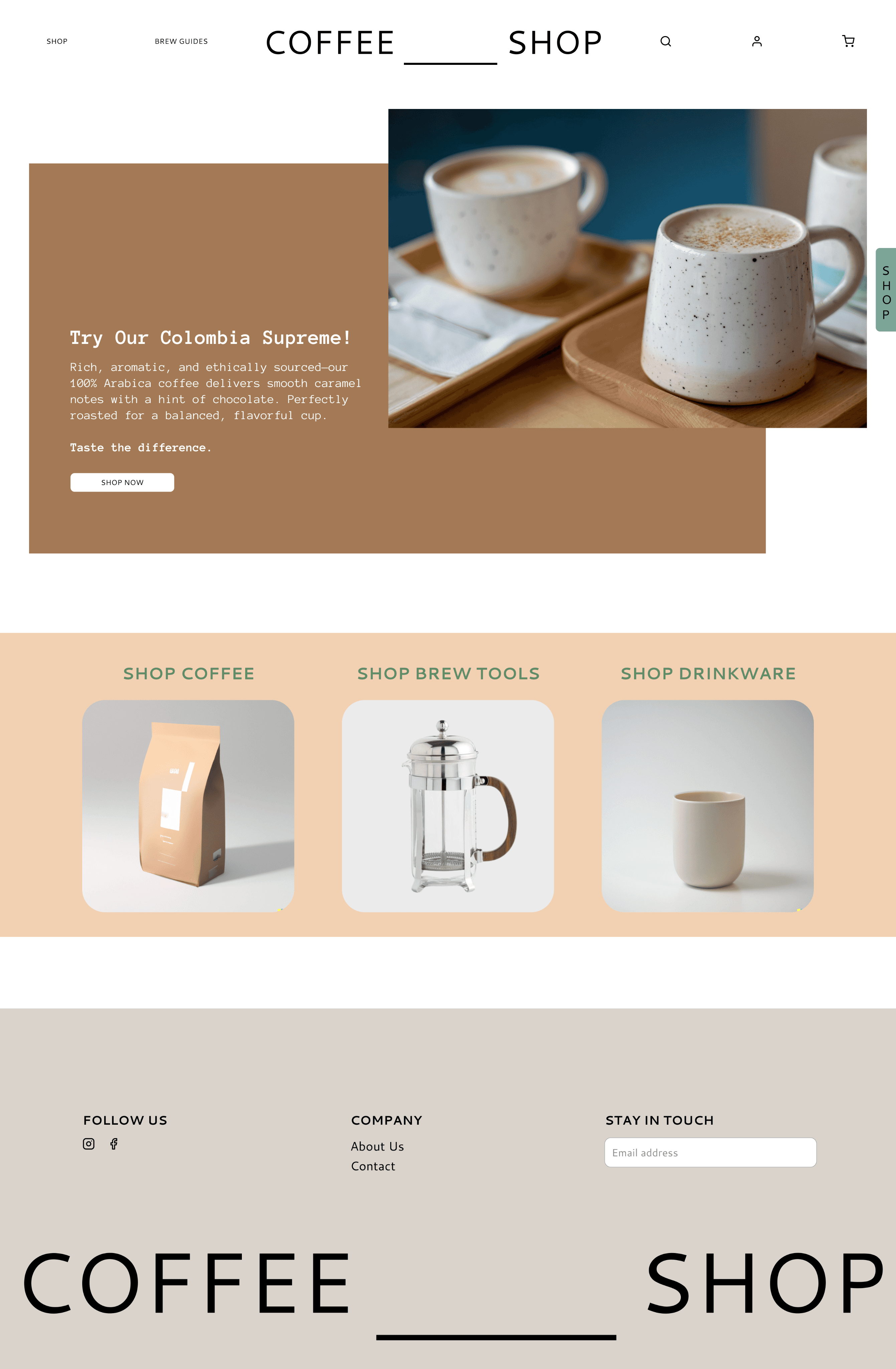
I developed the branding for Coffee_Shop inspired by cozy, transparent, and earthy aesthetics. Colors were sourced from an image of a modern coffee shop that spoke to the space the brand sought to create. Fonts were chosen for readability and warmth.

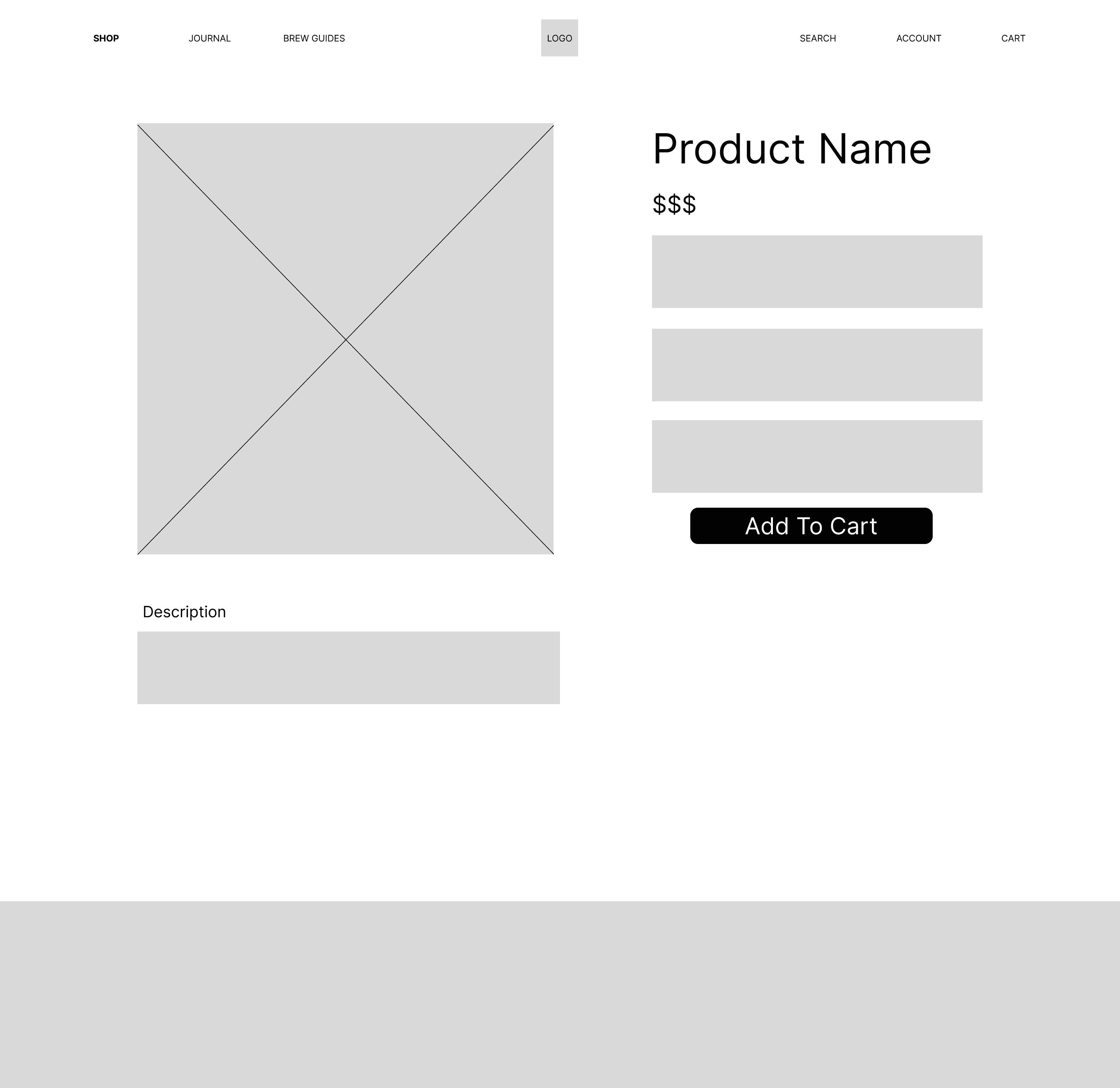
Wireframes
I created early wireframes for key pages, including the homepage, shop, product, and journal — to explore layout ideas, structure the site architecture, and visualize future features like articles and brew guides.
Due to time constraints, not all features shown in the wireframes were fully developed in the final prototype. However, these wireframes were essential in clarifying the structure, helping me think through content hierarchy and user flow early in the design process.


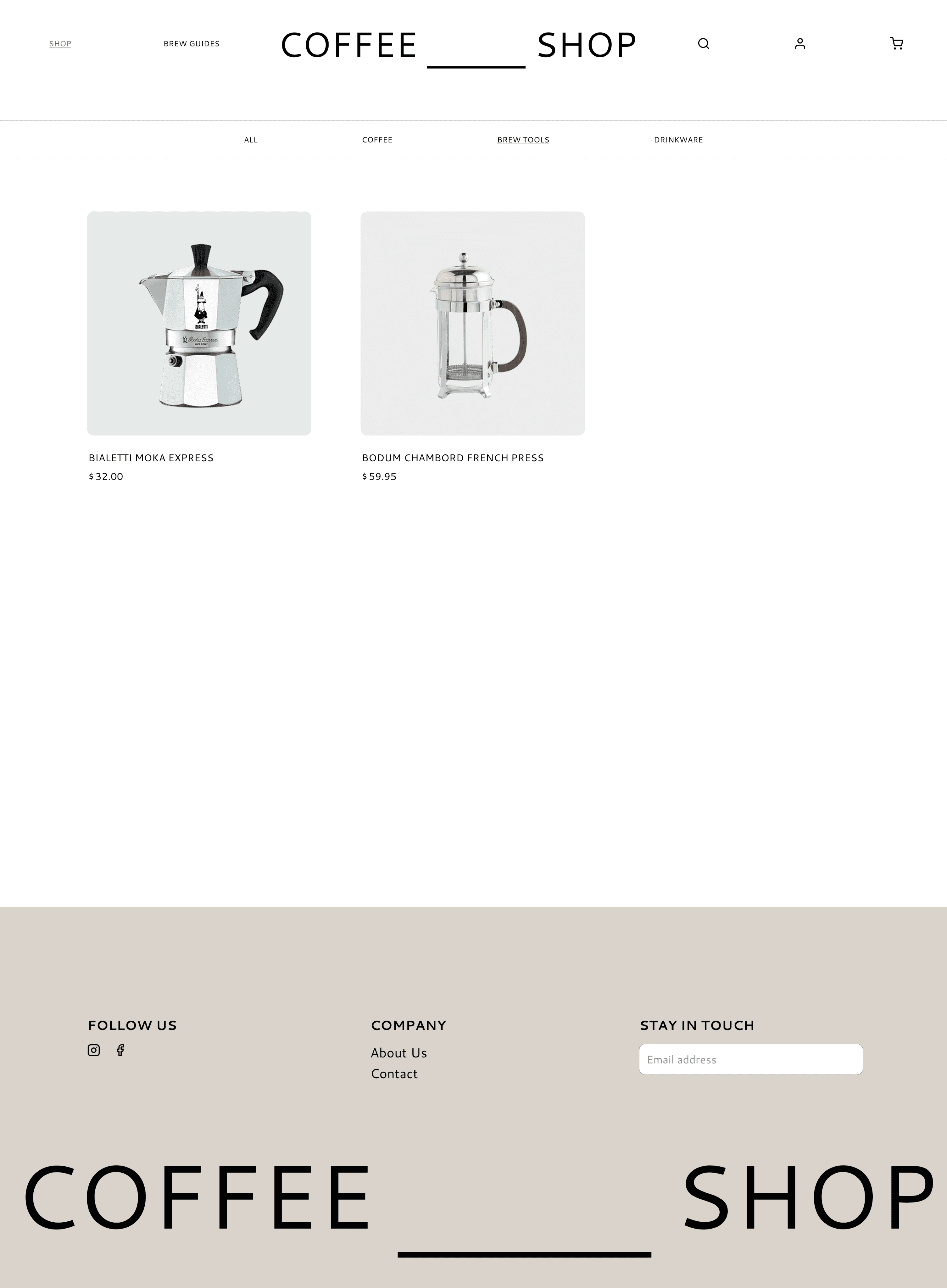
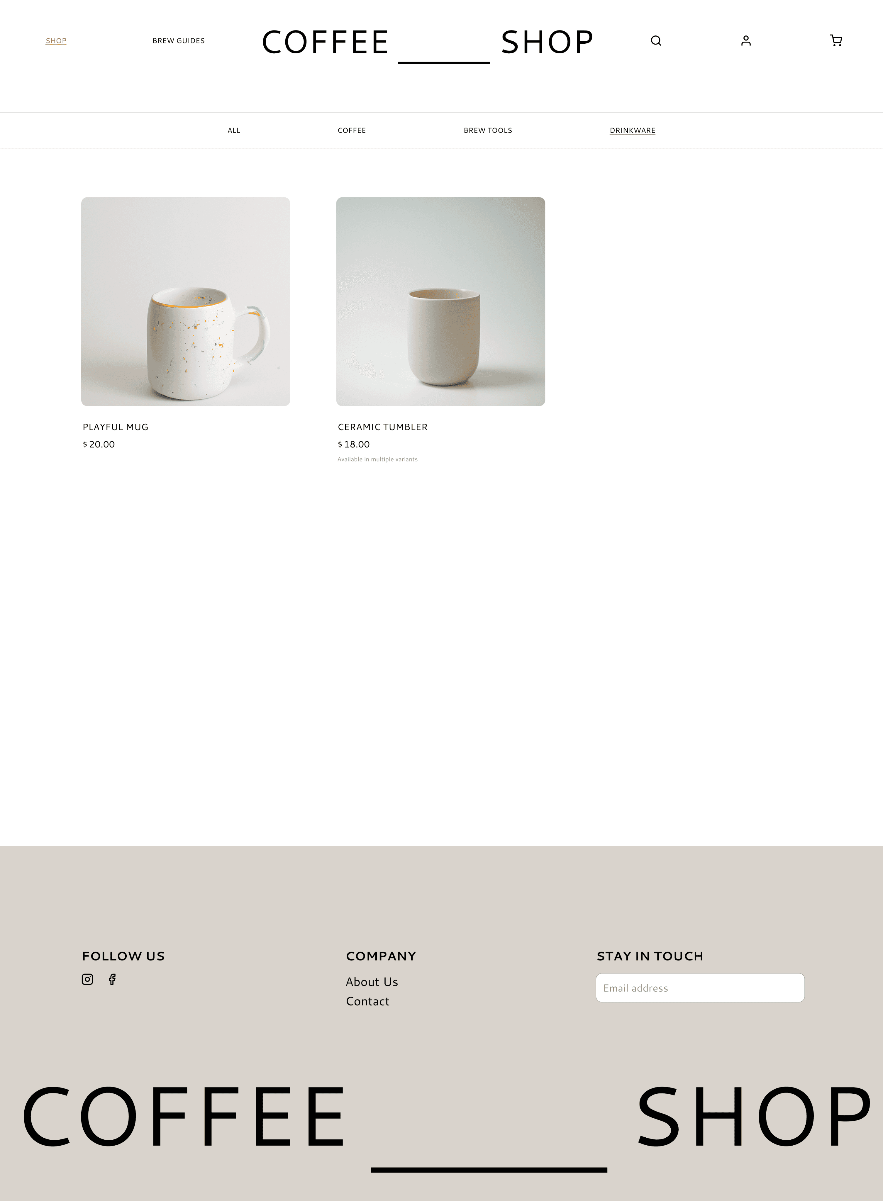
Final Designs
Homepage: Highlights featured coffee and categories
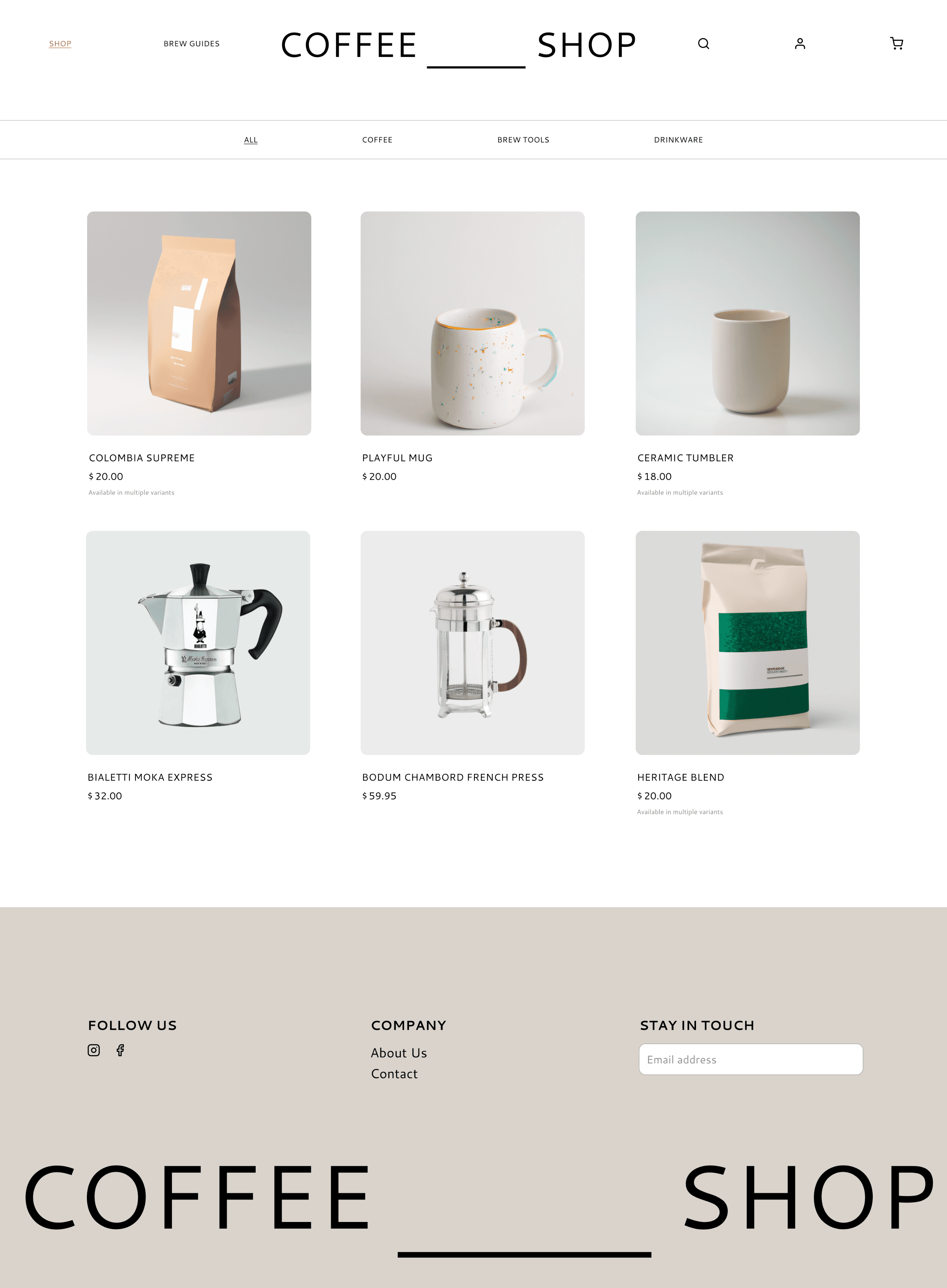
Shop: Filters by category (coffee, brew tools, drinkware)
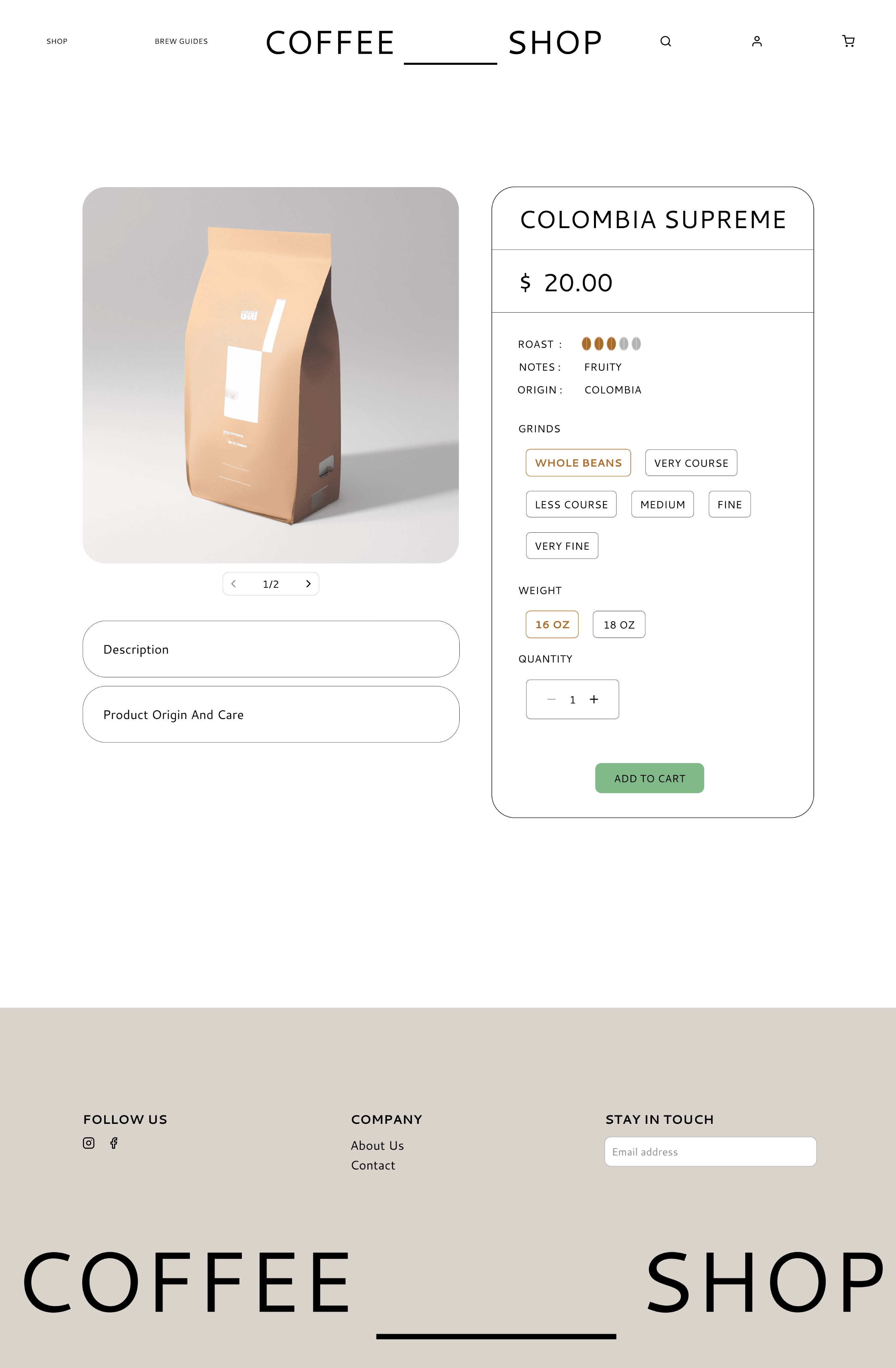
Product Pages: Grind and weight selectors, color selectors, add to cart.

Conclusion
Reflection
This was my first full web design project. Starting with branding was both exciting and intimidating. I leaned into using AI tools like DALL-E to generate visual assets when photo sourcing became a challenge. I also pushed myself to use more color and bolder typography than I normally do.
I now feel more confident designing desktop experiences and making product decisions that reflect both brand and user needs.
Next Steps
Build out the full checkout flow
Create mobile responsive screens
Add Brew Guides and Journal pages
Conduct user testing to refine layout and navigation
Add subtle animations for microinteractions